Life is too short for bad coffee.
Barista Valet
Barista Valet is a subscription-based coffee delivery service based in Brooklyn. They are a new and quickly growing company, currently operating with a web-based app. They want to build a loyal customer base, increase retention, and offer local breakfast items with a daily coffee delivery, eventually transitioning into using a native app.
Overview
Timeline
3 weeks
My role
UX Designer, Researcher, and Project Manager
Our goal
Increase customer satisfaction and retention by building food options into existing platform and fostering a sense of community.
Process
-
We interviewed coffee drinkers who were passionate about quality and prioritized convenience.
-
Using our interview findings, we defined our target user and identified their pain points.
-
We built designs that catered to our users’ needs and iterated based on testing results.
-
The Barista Valet team was ecstatic to see our final product and plans to implement our suggested designs.
Tools
Figma
Methods
Business Model Canvas
Competitive Feature Analysis
Heuristic Evaluation
User Interviews
Affinity Mapping
Persona Development
Journey Mapping
Usability Testing
Research 🔍
Business Research
To further understand Barista Valet as a company and the niche they occupy, we created a business model canvas and competitive feature analysis. In addition, we ran a heuristic evaluation of their existing application.
User Interviews
We interviewed 14 coffee drinkers to try and identify what features would be most helpful in the updated Barista Valet application. 10 of those users had never heard of Barista Valet, and the other 4 were active subscribers or currently participating in a free trial. We asked them about their coffee priorities, likes and dislikes, and what kept them from their dream cup every morning.
Insights
We poured over (ha) the data from our 14 interviews, looking for trends and patterns, finding the clues to solve the puzzle of a successful coffee delivery app. Overall, our most important insights were:
1. Coffee drinkers are interested in learning more about their brew and prioritize supporting local, sustainable businesses.
2. Most people know how they like their coffee and what flavors they like, but are open to trying new drinks and experimenting.
For more detail, see our full affinity map and complete list of themes and insights.
Synthesis 📍
Target User
As we interviewed, our target user became clear: hardworking 30-somethings with limited time and energy.
They are interested in drinking high-quality coffee, but can’t commit to researching, sourcing, and buying locally sourced beans and high-quality equipment.
Persona
To help us visualize and focus on Barista Valet’s target audience, we created a persona.
Meet Sam: a 31 year old Financial Analyst living in Brooklyn, NY. She has a hectic schedule, prioritizes convenience, and values high-caliber coffee.
“I love high quality coffee, but it can be expensive and time consuming to make the way I like it.”
Coffee is an essential part of Sam’s day, but with her busy job and lifestyle, it can be difficult to make it the way she likes it. She would love to buy beans from local roasters and support nearby coffee shops, but doesn’t always have the time or room in her budget. In a perfect world, she would grind her own beans and use a pour over, but her morning schedule can be unpredictable and she has limited space in her apartment for coffee equipment.
Goals
Explore new types of coffee while supporting local businesses
Needs
A convenient coffee routine and affordable, high quality beans
Frustrations
It’s hard to find coffee that matches her specifications, and she doesn’t have room in her apartment for fancy equipment
Feature Prioritization
As we processed our interview data and began to consider our design, we revisited our list of potential features and began to prioritize. All the while we asked ourselves: how we might provide Sara with convenient coffee delivery while creating community and increasing her coffee knowledge?
Our interview insights drove our decision-making as we chose which features to build. We landed on 3 main design focuses:
-
We integrated a food feature in the existing drink menu structure.
-
Users can connect with people in their apartments and share their drinks.
-
We added detail on each roast that Barista Valet offers as well as a coffee quiz that helps users discover new drinks.
Design 🛠
Design Studio
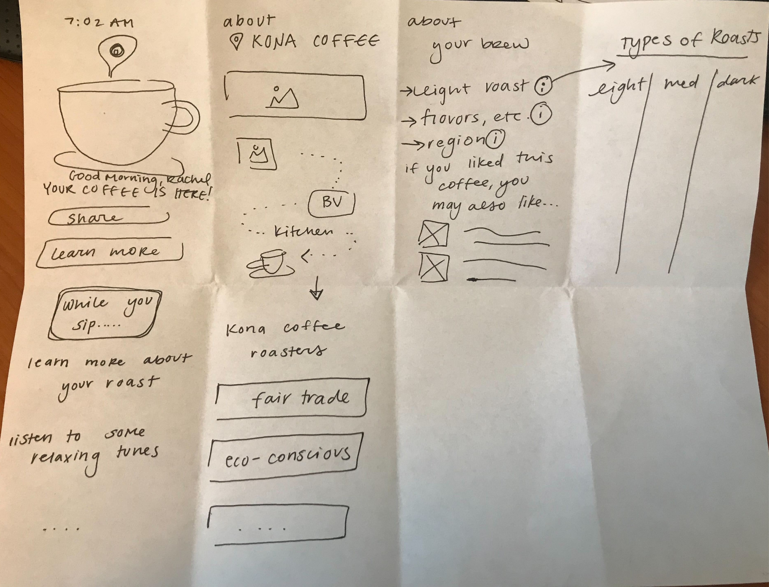
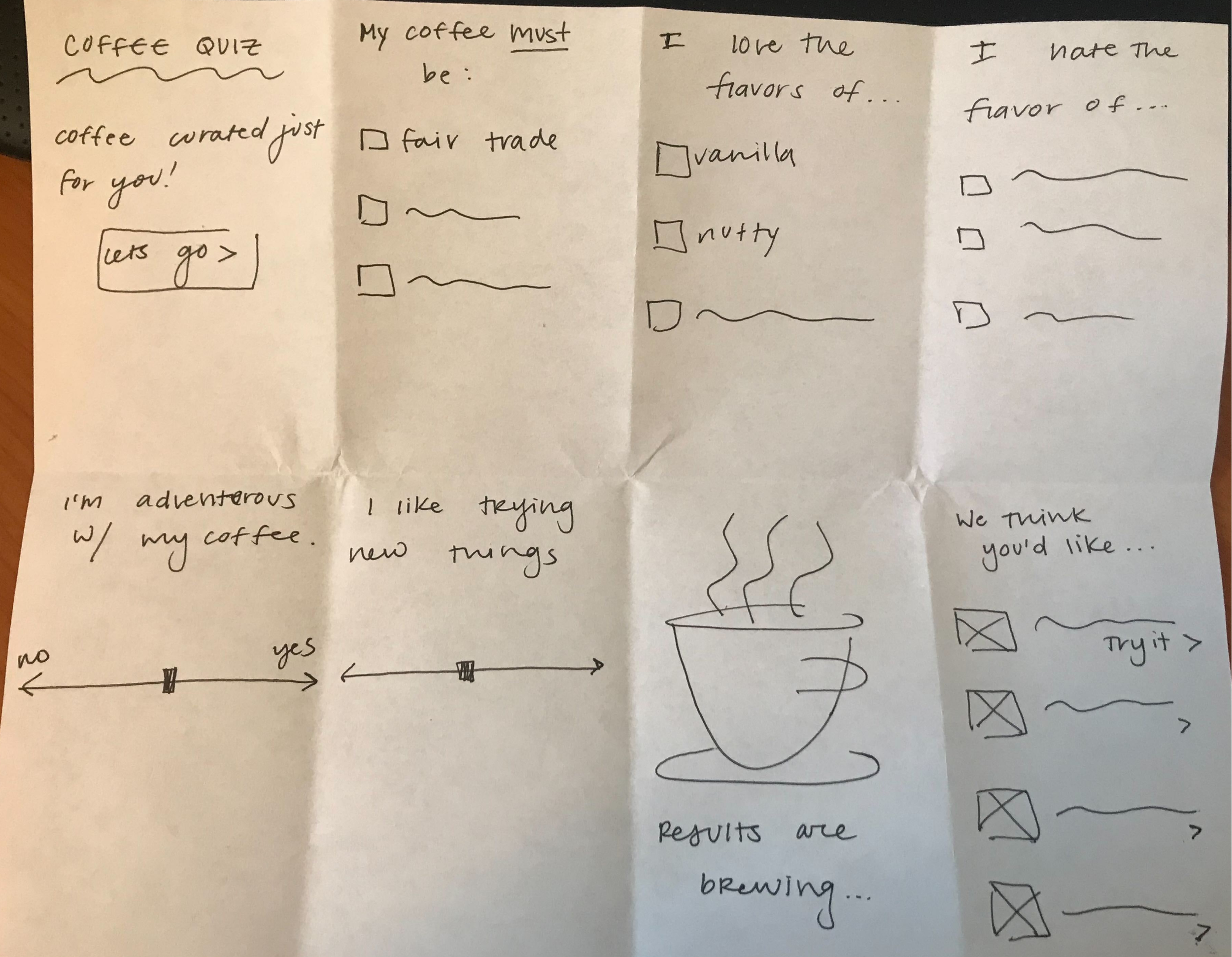
We kickstarted our design process with a design studio, then iterated and tested our way through to a high-fidelity prototype. Our design studio helped establish the structure of the three features we were focusing on: food, community, and education.
Usability Testing
We ran two rounds of usability testing, one on our MidFi prototype and one on our HiFi, asking interviewees to spill the beans (ha) and share their thoughts.
Each round of testing consisted of 5 users completing four tasks that we felt reflected the needs of our target user. The feedback that users gave us drove our design changes as we upgraded to a HiFi model, and then a final prototype to hand over to Barista Valet.
We asked users to complete 4 tasks, one for each of the main features we focused on building. This graph illustrates the changes in the average success rate we saw between our two rounds of usability testing.
The success rate was calculated based on if users directly completed the task, indirectly completed the task, or failed the task.
Deliver ☕️
Based on the results of our usability testing, we updated our designs until they were ready to present to the Barista Valet team. What follows are our final designs and areas of improvement.
Final Designs
Home page: increasing interactivity and functionality
We remodeled the Home Page of the Barista Valet app after realizing that users didn’t realize they could scroll, and therefore weren’t utilizing the full functionality of the application. Users also gave feedback that the original home page felt “clunky” and not very exciting.
On our revised version of the application, users had a much easier time finding roast information as well as the coffee quiz, which we attributed to the new home page layout.
Updated Design
✅ Revised categories
✅ Navigation bar
❌ Users didn’t know how to scroll
❌ Bulky images
❌ “Basic” and “clunky”
Original Design
✅ Engaging
✅ Easier to find relevant information
Updated Design
Menu: adding clarity and breakfast
We revised the menu labels to increase clarity and added a ‘Breakfast’ option. We also added navigation bars so users knew where they were in the menu.
❌ Ambiguous categories
❌ No indication of user’s location
❌ No food options
Original Design
Education: learn while you sip
The existing Barista Valet app had very limited information about the roasts they offered, without any information on brands or the background of different beans. We expanded on this by adding details on each of their current brews, including flavor, region of origin, and information about the roaster.
Users can also take a coffee quiz to explore and learn more about different drinks or roasts that they may enjoy.
“I want to know more about where my coffee is sourced from and want to make sure I am supporting local businesses.”
Community: connect over a cup
We built out a completely new community feature for Barista Valet based on ideas they had and feedback we got during user interviews. It consists of a local feed where you can see what people around you are drinking, share your beverage, and read about local roasters.
We initially titled this feature “Community” and linked it to the home page, but renamed it “Neighbors” and put it in the global navigation after users had difficulty finding it and were unsure what it meant.
“The community feature is a cool way to interact with your neighbors, it’s unique.”
Future Recommendations
Time was a major limiting factor during our work with Barista Valet. We tackled a range of different aspects of their application in only three weeks, and we’re still able to hand over a product we were proud of. However, if I were to continue working on this project or were to make further suggestions to the Barista Valet team, I would focus on the following areas.
Quiz: I would like to do more in-depth user testing on the coffee quiz, including the length, questions, imagery, and resulting recommendations.
Community: The new ‘Neighbors’ feature has a huge amount of potential that I would be excited to keep exploring.
Accessibility: The Barista Valet team provided us with a style guide and asked us to stick to it. Given the chance, I would love to look into their colors and design and assess it for accessibility.
Reflections
It was a pleasure working with the Barista Valet team and exciting to work on designs meant to bring people joy and make their mornings a little easier.
That isn’t to say that our process was always smooth. Our team faced two main challenges:
Designing what the Barista Valet team asked for, while also prioritizing user needs
Aligning the design team on style and visuals
Both issues were ultimately resolved with lots of respectful, honest communication, and plenty of design iterations and compromises. We finished the three-week sprint with a product we were all proud of.
I really enjoyed the opportunity to step into a leadership role during this project, and certainly learned a lot about the challenges of facilitating a cross-functional team with differing backgrounds and perspectives. A few takeaways:
Communication is ✨ key ✨
Along with frequent team check-ins to ensure aligned goals and motives
As a UX Designer, you are responsible for both 1️⃣ user and 2️⃣ client needs
It was an interesting challenge to align the Barista Valet team’s needs with the feedback and data from user interviews
Despite some setbacks, this project sure was a latte fun (ha), and the Barista Valet team was ecstatic about the final product. I’m excited to continue to grow my leadership and design skills moving forward, as well as my now vast knowledge of coffee beans.


